|
Basic
Monitor Calibration & PhotoShop Colour Workspace Settings
Does your monitor match your prints? Why are
your prints too dark?
David
Myers: DIGITALMASTERS
australasia
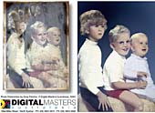
David
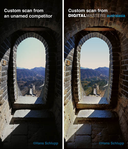
Myers of Digital Masters has over 35 years fine art and photographic exhibition
printing experience. David works closely with you to 'optimise'
your images
with online 'approval' and 'before & after' proofs to enable the production
of
hand crafted archival prints that exceed your expectations and meet
the quality standards laid down by the Fine Arts Trade Guild...
...but
our prints will only match your screen when your monitor is correctly
adjusted for print!
Do
your prints always come out looking way too dark compared to your monitor
image?
That's
because your monitor is set to super bright 'gaming' & 'video' standards
that
are are around 400% the brightness of paper based print values!
You are then
'darkening' your images in PhotoShop so they look OK on your uncalibrated
screen and are then sending those 'darkened' images to your printer!
The
solution is to print a perfect 'reference image' with known colours and
tonal values using
the correct media profiles for your printer, inkset and paper via PhotoShop's
professional
colour managed print routines. Then you should illuminate this 'Master
Print' with a
daylight balance viewing lamp or viewing booth alongside your monitor
and use
hardware / software
monitor adjustments to make the screen match the print!
Modern
flat screen displays come 'out of the box' way too bright for print matching.
When
you make your images darker to look good on screen you end up with dark
prints!
Even worse you have 'thrown away' valuable shadow details from your images!
To keep an eye on your monitor brightness each of our web pages has a
'quick screen calibration checker' greyscale at the bottom...

The
top 'bar' of the calibration image comprises alternating 0% black and
5% grey squares.
You should ONLY JUST be able to perceive the bar as bands rather than
an all black strip.
The bottom comprises 21 steps of neutral grey in 5% steps from 0% black
to 100% white.
1
ROOM
LIGHTING
Turn
off or lower your room lighting If you are doing any colour imaging for
professional print output!
Screens are illuminated by light coming from behind so any light hitting
the front will make the
blacks look grey and meaning will never see the full range of tones in
the shadow areas.
2
CONTRAST
ADJUSTMENT
Locate
your monitor's hardware controls and set the contrast to 100% maximum.
If you have a traditional
CRT monitor that is more than 2 or 3 years old the screen phosphors may
have faded and the colour
'guns' may no longer run at full, linear output. If your image may always
look unsaturated with
murky grey blacks you should replace it. We recommend Apple, Eizo, NEC
and LaCie.
3
BRIGHTNESS
ADJUSTMENT
Adjust the brightness CAREFULLY until you can ONLY JUST see the bands
in the top bar of the image above.
Keep an eye on the grey squares below - especially the three at each end
of the scale.
4
MONITOR TOO BRIGHT ( Very
Common - prints come out too dark )

If
your adjustment looks like the effect in the image above your monitor
is TOO BRIGHT There are 21 grey steps
in the bottom bar - See how the LAST three segments have gone white
If left like this you would see lots
of shadow details in images but highlights would be too light with 'washed
out' areas in clouds etc.
5
MONITOR TOO DARK ( Rare
- prints come out too light )

If
your adjustment looks like the the effect in the image above your monitor
is TOO DARK
There are 21 grey steps in the bottom bar - See how the first three segments
have gone black
You would see lots of highlight detail in images but shadows would be
'blocked up' with no detail
6
COLOUR TEMPERATURE
If your monitor controls
activate an onscreen display look for a dialogue that refers to
'Colour Temperature' - a preset colour balance to match the colour of
daylight at different times
9,300K
(degrees Kelvin) is cold blue skylight - the approximate colour of an
unadjusted CRT monitor
5,000K (Or 'D50') is warm noon day sunlight - The tradition target for
print industry monitors
Imaging professionals use a setting of 5,500K to 6,500K to display neutral
to cool greys
7
COLOUR BALANCE
If your monitor hardware
controls activate an onscreen display with 'Tint' settings or RGB adjustment
'Sliders' you can open a reference image to 'Fine Tune' your display so
it matches a reference print
from your printer. If you do this while viewing the image with 'Soft Proofing'
in PhotoShop
you can get very accurate monitor calibration and
greatly reduce print wastage!
8
REFERENCE
IMAGES
A reference image
should contain a neutral greyscale with no colour shifts, skin tones,
colour patches
such as industry standard Kodak or Macbeth charts and any images typical
of your
type and
style of photography or artwork. Do not use a photo of unknown tonal and
colour values
as you will be trying to calibrate your monitor to match an 'uncalibrated'
image
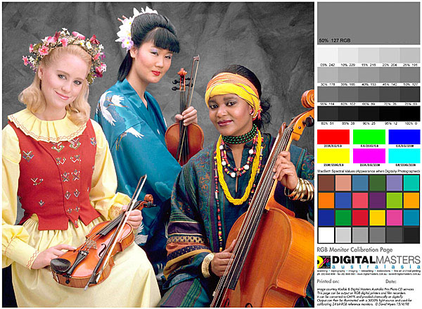
This
Kodak licensed image was modified by us and converted to 'Adobe RGB' colour
space. The above small
web image was converted to 'sRGB' for viewing in browsers.
Greys are neutral and the skin tones have
proved to print well on a variety of printers. You can download view the
full size version and view
on-screen to make basic adjustments to your monitor settings. You should
print the full size
version with your printer paper profile then use PhotoShop's 'Soft Proofing'
to view the
image with the same paper profile. View the print with a daylight balance
lamp
then you can adjust your monitor to match it. This is a basic adjustment
only - we highly recommend the use of a proper screen
calibrator
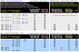
Download
compressed print file: 250mm Print in 'Adobe RGB' profile for professional
printing: Download
Page
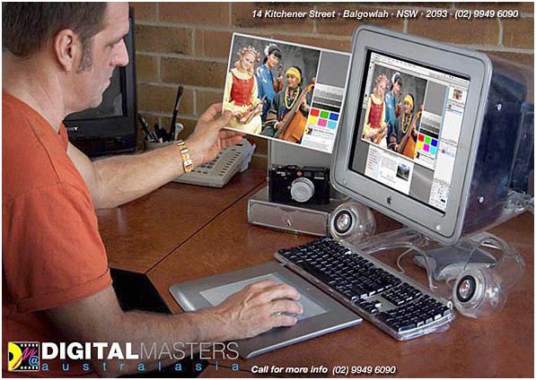
'Simple'
use of a reference print to perform a basic monitor adjustment - turn
down the general room
lighting and use a desk lamp with a daylight balance halogen or low voltage
bulb to illuminate the
print. Shield the monitor with a black card shroud to stop stray light
degrading the image shadows.
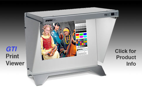
We
have used and recommended GTI professional print viewing booths since
1990
They now make 'entry level' desktop units that you can't afford not to
own...

See
Luminous Landscape's 'Evaluating Your Prints Properly' tutorial: Link
9
PHOTOSHOP
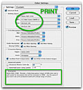
SETTINGS
PhotoShop
needs to know what 'RGB Workspace' you
work in. This needs to be configured in 'Color
Settings'
If
you are primarily involved in producing images for web, use images from
consumer level digital cameras and
print scanners, print via home quality inkjet, laser, quickprint lab,
kiosk or Fuji Frontier printers use 'sRGB'
If
you are an imaging professional primarily producing images for print,
use images from pro SLR digital cameras,
digital backs, pre-press film scanners, print via photo quality inkjet,
Giclee & prolab printers use 'Adobe
RGB'
Adobe
RGB is the Preferred Color Setting and
colour 'Profile' for all imaging work an d 'Digital Master' files as it
provides a greater colour and tonal range. You can always 'Convert Down'
to sRGB for low end 'quickprints'
and web images but if you inadvertentlly use sRGB for a professional print
job you can't get back the
missing colours and tones by converting to Adobe RGB. Check your PhotoShop
Settings and get
used to switching between Adobe RGB for pro work and sRGB for web and
quickprints!
10
WEB IMAGES
If you
are primarily involved in producing images for the web you now know you
should work in sRGB Colorspace.
To ensure your images look
good onscreen in web browsers you need to 'Embed' the sRGB profile.
Images
display differently with each ICC profile or if 'untagged'.
11
CALIBRATION
DEVICES
'Print
matching' calibration is reasonably accurate as you have visible proof
that your monitor is matching
images from your printer. As monitors age, the colours fade and
the illumination becomes dimmer
and as monitor calibrators are now available from $100 we recommend that
you use one!
Monitor calibrators attache to or hang in front of your screen and correct
for small
imperfections that the eye can not see. The software supplied allows for
known 'industry standard' presets to be targetted and take away
the guesswork - We use the Eye-One calibrator from X-Rite
12
COLOUR MANAGED PRINTING
Below
is a video tutorial guiding you through colour managed print workflows
for both Mac OSX and Windows.
Click on the image to run the high resolution video. Quicktime required:
Free Quicktime Download
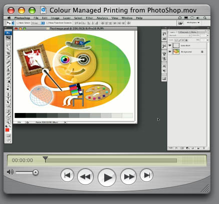
Author: Russell Brown - One of the developers of Adobe Photoshop
View his brilliant tutorials online: The
Russell Brown Show
QUESTIONS?
eMail
DAVID MYERS
DIGITALMASTERS
australasia
homepage
|